Friday, May 28, 2010
More Lala
Hello there! Yay! It's Friday! Are you as happy about this as I am? And it's a long weekend to boot ;D Doing anything special to celebrate? I'm meeting my buddy for a pedi tomorrow morning, which I absolutely positively need and you would know this if you have spied my gnarley (not in a good way) toes and feet as of late. Tomorrow night I'm taking the hubbs out for a celebratory birthday dinner to a fabulous local restaurant here in Albuquerque called Artichoke Cafe. Lovely place, lovely food. Let me add also, that hubbs has beautiful baby smooth feet and has never had a pedi in his life. So not fair. Sunday we're off to a cookout/party with friends. AND after all of those fun and festive events, we still have Monday to relax and just enjoy the day :) Let me just add a sincere, heartfelt "thank you" to the families of the men and women who have given their lives and those who risk their lives everyday to allow us the freedom to experience such luxuries.
Today I have another Lala image to share with you. This is Lala with Rose and she is just as adorable as all of the other Lala images. Head on over to La-la Land Crafts and check out all of the wonderful stamps, both digi and cling mounted rubber, that they have to offer. Their site is so pretty and if you visit the gallery, you'll see many beautiful card samples using their images.
I have to confess. This card was born out of an accident and a complete inability of mine to follow directions. Until a couple of years ago, I used to be one of those folks who read directions thoroughly, on some occasions, two and three times. Not so much now. So when I saw the description of this week's La-la Land Weekly Wednesday Challenge, I spied the word "Nestabilities", squealed with delight, then proceeded to make a card piled high with die cut Nestie shapes. Little did I realize that the challenge was to create a Nestie "Shaped" Card. Ooops! Back to the drawing board! Looking on the bright side, this gives me another card to share with you and something new to add to my blog.
This card was Take One. Hmmm, no, I don't mean "take one" as in take it, but "Take One" as in I had to do it again and that was "Take Two" and if I messed it up again, that would be "Take Three"...LOL...you get what I mean ;D Luckily I only had to go as high as Take Two. Again, this card features Lala with Rose. I have colored her with Copics and for her I opted for black hair. I am in a Red and Aqua frenzy right now, so once again you see that obsession making an appearance here. I sponged Lipstick Red and Fired Brick Distress Inks on the panel behind Lala, who sits atop a pile of three Nestie die cuts. All of this is anchored by the beautiful Cosmo Cricket patterned paper underneath. A little glitter glue, a couple of flowers, and a few gems are a must on all my cards, and this one was no exception. Okay, another confession. Her eyes look a bit odd. They started out green and then I decided to go brown. This resulted in giving Lala the appearance that her eyes sort of resemble a cat's. AND as if that wasn't enough, I added a couple of drops of dimensional glaze...not a wise choice. Oh well, she is still sweet none-the-less ;D If you're interested in seeing my Take Two card, click here.
That's it for today. I hope you have a wonderful Memorial Day Weekend! Don't forget to get inky!
Thursday, May 27, 2010
A Very Happy "Un"Birthday!
Good Morning! I want to thank everyone who visited my blog yesterday, whether you were swinging by for the La-la Land Weekly Challenge, or the Bombshell Blog Hop, or maybe you were just stopping by to say "hi". Thank you! I love visitors!
Today I am sharing with you a card that I made for my sister to give my husband for his birthday. Did you catch all that? I even charged her for it! Sort of hateful considering I was going to end up with it after all was said and done...lol! Oh well, I'm a shrewd business tycoon! ;D
While you are deciding if I am rotten sibling, I'll tell you about the card. The image is from the original illustrations found in Alice in Wonderland. Lots of stamp companies produce these images, but this one in particular is by Mad Rat Rubber. It's a little larger than some I have seen and makes a great focal point for a card. I kept this simple and really tried to go masculine with it, but glitter glue and a white bow somehow found their way to the front. I have no earthly idea how that happened. You will note, I did refrain from adding any flowers or gems, so that must be worth an "atta girl" or something.
I colored the rabbit with Copics, but didn't add too much color, because I wanted it to appear that the rabbit and his smock are mostly white. The edges of the main panel are smudged with Antique Linen and Vintage Photo Distress Inks. Finally, that yummy patterned paper setting the stage for everything else is by Cosmo Cricket. The inside says "A very happy 'un'birthday". I had an older Anna Griffin stamp and just aded the "un" in front of "birthday" by hand. I forgot to take a photo of the inside, so you'll just have to trust me.
That's it for today. I'm heading out the door to hang out with the artsy peeps who flock to China Phoenix 2 on Thursdays! See you tomorrow with something new!
Wednesday, May 26, 2010
Light and Bright Picture Taking: A Tutorial of Sorts
This originally posted on February 17th, but I've been thinking about photo quality lately and decided to post it again. I have had a few inquiries on taking pictures of small projects and while I am not a master at photography, I have done a bit of research on picture quality and would love to share what I've uncovered.
I'm ready for my close-up, Mr. De Mille. I just did a quick little Google on this famous movie line from Sunset Boulevard and was surprised that it is often misquoted...as in my case now...LOL! The line is actually "All right, Mr. De Mille. I'm ready for my close-up". My apologies to all of the celluloid aficionados out there!
This post is dedicated to my photo set-up for taking pictures of my cards. I have seen lots of places on the Internet with folks posing the question "should I buy a light box". About a year ago, I was lost in the same conundrum and wanted to figure out a way to add some life to my photos. No matter how hard I tried, they always seemed gray and dull. The colors were never vibrant and never portrayed the card accurately. I started to comb the Internet for tips on remedying these ailments.
Here's what I came up with:
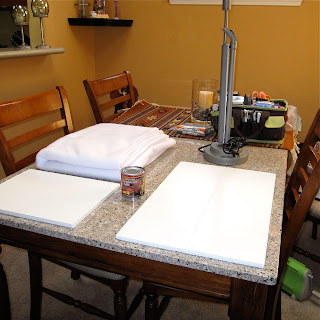
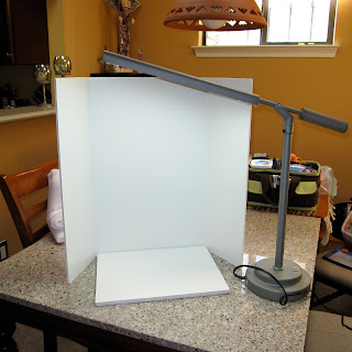
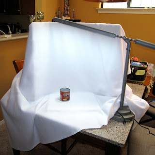
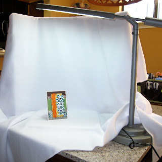
1. There is no need to invest in an expensive light box. The pictures above show my set-up, which consists of a tri-fold presentation board (the kind used for Science Fair projects), an Ott Light, 2 yards of white fleece fabric, and a can of condensed milk...hahaha! I bet that last item got your attention ;D I arrange the fabric over the tri-fold presentation board and then set up my Ott Light to cast light down over the draped fabric. My can of condensed milk is just the right size to prop my card against and does not obstruct my shot in any way. I purchased all of these items, except for the milk, from my local Hobby Lobby for just a few dollars. The whole set-up takes only a few minutes to assemble and even less time to take down.
2. Before I shoot any pictues, I make a few adjustment to my camera. First, I turn off the flash. Using the flash seems to create glare and hotspots in my photos, which in turn drown out details on my card. Me no likey this :(
3. Speaking of details...I want to capture all of them, so I switch my camera to the Macro setting. This allows me to get in really close and not waste any of the hard work spent crafting my little art piece.
4. After I have adjusted my settings and set-up my make shift light box, I manually set the White Balance by going to the White Balance setting on my camera, selecting "custom", aiming my camera at my little staging area so that only the white fleece fabric fills my lens and (on my camera) clicking the DISP button. This step may vary, but will probably be similar for many point and shoot cameras. Once I do that, I am ready to get this show on the road!
5. I get in really close for photos and take LOTS of pictures. Since I am going to the extra effort, I may as well make it worth my while. There is no bigger let down than setting all this up, taking one shot, and then finding out that it is blurry because my hand quivered a bit at the last second. UGH!
6. Once I have my pics and have loaded them on the computer, I do a little editing and select only the best ones, weeding out the ones that just aren't quite there. After I have the creme de la creme of photos sorted out from the...ummm...not so creme photos, I do a bit of editing in my photo editor. I crop out a lot of the background, brighten my white levels, and adjust the sharpness.
Compared to propping the card on the dining room table and just letting the camera do it's thing, there is an amazing difference! I figure, if I am going to take the time and creative energy to build a card for someone special, then I may as well attempt to present my work in the best possible light (pun intended) to the rest of the world. My pics may not be on the caliber of a professional photog, in fact, I can guarantee they're not, but with the use of a few tools and camera adjustments I can easily take a picture from gray and dull to vibrant and bright. Me likey that ;D
Blog Hoppin' with the Bombshells
I have two posts today, so be sure to scroll down to catch my other entry ;D
Today I am blog hoppin' with the Bombshells! This month's hop challenge is titled, "Look Ma, I Did It!" Bombshell Hop Captain, Kasmello, gives us the deets:
Call it a Mother's Day theme....or Just fun. This month, we want to see what you are made of....and what you can make.
You can make any sort of project, a card, a layout, an altered object...whatever...you just need to make a handmade embellishment. It can be a flower, button, etc... You just have to make it.
Pair it with a great Bombshell stamp and get ready for the bloghop.
My husband's birthday was yesterday and as I have thoroughly confessed on numerous occasions, I am a procrastinator. Therefore, by process of elimination, and you, being the crafty sleuth that you are, can already deduce that I did not even start his card until yesterday afternoon. Lucky for me, I am the proud owner of a legitimate "Bag of Tricks". What?! You thought that was just a saying? No way! It actually exists and I am in possession of it...lol! Actually, it just boils down to a couple of large plastic gallon zip-top bags that act as the home to a number of pre-stamped images, some colored, some not, and lots of little pieces of "this and that". Given that Bombshell Stamps is one of my favorite stamp companies, it stands to reason that there is a substantial inventory of BSS images in those bags just waiting to be turned into something crafty. That was the case with this flaming heart from the Sacred Heart set. It was even colored and the vine was already double embossed to give it some dimension. This image might look familiar to you. That's because I used an identical heart on this card here. Nope, I didn't cannibalize the other card to create this one. For whatever reason, when I get on a coloring kick, I have a tendency to do up multiples of the same image. Crazy, huh!
Long story short, my "Bag of Tricks" came to my rescue once again and I was able to put this card together relatively quickly. My handmade embellie is the little yellow felt flower in the corner. I love this flower and have vowed to make these in mass quantities as soon as I have a sec. It was really easy to do. I found a link to this tutorial by Lollychops on one of my favorite blogs and truly thought I had stumbled upon the Treasure of the Sierra Madre...haha! Flowers...! We don't need no stinkin' flowers...!! Okay, I'm a dork ;D BUT, this dork does need flowers and this tutorial is gonna' quench that botanical thirst. Check it out! You'll dig it ;D
Back to the blog hop! There are lots of talented paper artists waiting for you to share some love by visiting their blogs. Leave a comment at each stop along the way for your chance to win May's prize package! Hit all the stops on the list below and I guarantee you will be hankering to play with some Bombshell images. Next month why not join the hop by creating something awesome with those new BSS stamps that I know you're going to order ;D The hop takes place the last Wednesday of every month and our incomparable Blog Hop Captain, Kasmello, lays out the details in the BSS forum so be sure and stop in for a looksie.
Kas
Kelli
BoHoRose
Katie
Alison
Angie
Kathi
Cheryl Hola!
Sy
Meredith
MaryG
LLWWC #40 Nestabilities Shaped Cards
Hello and welcome to another La-la Land Weekly Wednesday Challenge! This week's challenge hostess is the talented 1LuvnMama and she has a good one for ya! Use your Nesties to create a shaped card. How cool is that?! I, myself, occasionally need to be reminded to think outside the box and this challenge is the perfect exercise to get the old noggin' moving in a creatively fresh direction when it comes to card crafting.
Everyone is welcome to play, but if you use a La-La Land Crafts image in your creation, you could be selected to win a $10 credit to use in the La-la Land Crafts boutique. If you're in the top 3 you will win a special La-La Land badge to proudly display on your blog.
1LuvnMama used the adorable image, Lala with Bunny on her card, so that image is 20% off this week. Swing by the shop to pick her up at this special price. Be sure to look around while you're there. In addition to high quality cling mounted stamps La-la Land Crafts also has several digital images, which are perfect for impatient folks like myself ;D Purchase a digi image today and join us in this week's challenge!
For my card, I used Sitting Lala. Isn't she sweet? I cannot stress how fun these images are to color with the Copics. Lots of open areas to practice shading and highlighting. Fabulous! I reached for a stack of my Nesties to use on this project and just layered them up. This is the perfect recipe for a quick and easy card. The addition of a little glitter glue and a paper flower takes this card from simple to special in just a matter of minutes.
Stop by the La-la Land Crafts Blog to see the beautiful inspiration pieces created by the crafty design team and to get the low down on the details for this week's challenge. I hope you join us! ;D
Saturday, May 22, 2010
June Card Class at CP2: B Line Babes Pt. 2
Good Morning! Just a really quick post today. As soon as I'm finished here, hubby and I are headed off to breakfast at Ezra's. Ezra's is the sister restaurant to Sophia's and it is situated in a bowling alley. Not particularly modern or charming, but the food will knock your socks off. Sophia's was featured on Diners, Drive-ins and Dives a while back, but it's very tiny and almost impossible to get a table there sometimes. Ezra's has the same menu and more, but it seems that it has remained under the radar, so let's keep it our little secret...ssshhhhhh! Hubby and I will each order an entree , whatever, sounds delicious from the menu or the special's board, and we'll also share an order of lemon kissed sour cream pancakes. Ahhhhh, heaven! Once the food arrives, I will commence to living my No Carb Left Behind philosophy of cleaning my plate. Mmmmm...!
I digress (again)! This card is part 2 of the B Line Babes class I am teaching at CP2 on June 26th. These images are so wonderful and so easy to color, they practically color themselves. I used my Copics (of course) and stayed in the green family for her outfit. The details on these images make them look like they might be difficult to color, but they are not. All of the shading is already there and acts as a guide for directing color placement. A little bit of ribbon and lace, and a few flowers and gems, and that was all she wrote.
Hubby is getting grumpy, so I better scoot. Ezra's...here we come!
Friday, May 21, 2010
ARRGGGHHHHH...!
Good Morning! No, the title of this post is not indicative of my current state of mind. As a matter of fact, I am in a Jolly (Roger...hehe) kind of mood ;D Instead, it represents my little friend, Alicia the Strawberry Pirate, who I have featured on my card today.
This is another stamp by Annie Rodrigue for Kraftin' Kimmie Stamps and is part of their Moonlight Whispers line. I purchased some of these pirate images a couple of months ago, but this is the first one I have inked up. Come to think of it, this image isn't mine. While visiting my mom this past weekend, I stamped a bunch of Kraftin' Kimmie images from the pirate line and the tea party set, but they were my mom's stamps. That means that mine still haven't seen ink...LOL! Note to self...must ink up every Kraftin' Kimmie stamp I have and stat! Anyway, I colored up a slew of these images, so you will probably see lots of them on my blog over the next week or so. How many is a slew? Based on my assessment...six. Hehe ;D
Alicia proved to be a wee bit more challenging to color, because of her patchwork dress and my indecisiveness. It took my quite a while to settle on colors, but I managed. Then I couldn't decide on hair color, but finally went with black. No brunette this time, because I went with browns on the hat and didn't want to lose the details of her quirky "do" with too much brown. I applied a little diminsional glaze on her sword and on the skulls of the skallywags under her boot. The tiny Jolly Roger behind Alicia is an image by Bombshell Stamps. The scrummy paper is by Cosmo Cricket and is so fabulous on both sides that I didn't know which side to use, but the yellow polka dots won out and Alicia didn't seem to mind ;D
Thanks for stopping by! Have a superb weekend and don't forget to get inky!
Wednesday, May 19, 2010
La-La's Weekly Wednesday Challenge #39
Hello! I am back from spending a fantastic long weekend with my mom. We shopped, ate, and laughed. It was the perfect getaway! Thanks, mom!
Today I am joining the La-La Land Crafts Design Team in my first ever La-La Weekly Wednesday Challenge. I am so excited to be hanging out with this super skilled group of artists. This week's challenge hostess is none other than the owner of La-La Land Crafts, the uber-sweet and talented Irina Blount and her theme this week is "Birthday Wishes". Everyone is welcome to play, but if you use a La-La Land Crafts image in your creation, you could be selected to win a $10 store credit. If you're in the top 3 you will win a special La-La Land badge to proudly display on your blog.
This week's special is 20% off Sitting Pretty Rosie. Swing by the shop to pick her up at this special price. While you're there, be sure to check out all of the other fabulous images and, if you're like me, and can't wait to start playing with them right away, take a gander at the group of digi images available for purchase.
For my card, I used Lala with Bunny. What a sweet image! As soon as I laid eyes on her, I thought pink and green. I colored her with Copics and then added dimensional lacquer to her eyes and shoes. She's a girlie girl, so I couldn't resist a bit of ribbon and, of course, no card is complete without a few paper flowers and gems.
Need more inspiration? Check out the beautiful designs created by the DT over on the La-La Land Crafts Blog where you'll also find more details about this week's challenge.
I can't wait to see your challenge entries! ;D
Friday, May 14, 2010
June Card Class at CP2: B Line Babes
Good Morning! This post will be short. What was that? Did I just hear a collective "sigh" of relief? Well, I never...! Just kidding...I know I have a tendency to ramble when I write my posts, but today I am blasting down South to visit my mom (singing polly wally doodle all the way). Do you remember that children's song? Sheesh, there I go again. FOCUS!
Anyway, I have a second June class scheduled at the end of the month (June 26th) and this time I am using more of the wonderful B Line Design images. They are all so elegant and fun. Lots of vintage stuff, which I love and have strayed away from for the past several months. Today's card is a bit different for me. I usually stick to two sizes, 4 1/4" x 6" or 5 1/2" x 5 1/5", but this image is long and lean and demanded a card to follow suit. I started off with the idea that the finished card would fit inside of a business sized envelope, but as I started to get carried away with the details, it is quite clear that this was not going to work that way. Maybe just wrap it in tissue and put it in a large bubble mailer. I would mail it in a bubble mailer anyway, so why bother with an extraneous envelope? Sounds good to me. I was a bit intimidated to color this image, thinking I needed to stick with super soft colors, but I decided to use pink and I rather like the results. For someone who "claims" to not care for pink, I sure am using it a lot lately ;D The papers are by Basic Grey and the flourish tucked behind the flowers is from one of the new Tim Holtz Alterations die cuts. I think I'm going to be using this flourish a lot, so I might is well cut a bunch and keep 'em handy, 'cuz I'm going to be slapping 'em on everything...lol!
This is the first of two cards I will be teaching on June 26th, but since I will be gone for a few days, I won't have another post ready until next Wednesday. In the meantime, have an inky weekend!!
Guest Designer for Lala Land Crafts
Guess what! I suppose the title of this post gave away my big announcement ;D Oh well, I'm too excited to care that I blew the surprise! I received an invite a few days ago to be a guest designer at Lala Land Crafts and I took one look at their images and said "Yes!", without any hesitation. Let's just say, I'm as happy as a stamper covered in ink! ;D
Are you familiar with this fab company? Allow me to introduce you. They have lots of fun and whimsical images featuring Lala and Rosie, a couple of cuties that are awesome to color. There is also a line of animal characters that I can't wait to work with, as well. Swing by their site and take a look around. Check out the gallery to see these images in action on some stunning cards. Also, be sure to take a gander at their blog. The Lala Land Crafts Design Team is uber-talented and the blog is just filled with their inspirational art work. Lala Land Crafts offers a different challenge each Wednesday. I don't have any cards up this go round, but I've already finished my card for the next challenge. I know! That in and of itself is amazing...LOL!!
This week's challenge is "Anything Goes" and Mermaid Lala is 20% off. One lucky winner will be awarded a $10 credit towards the Lala Land Crafts Shop and the top three entries will win a badge for their blog. What are you still doing here?! Get over there and check it out!
Wednesday, May 12, 2010
June Card Class at CP2: Part 3
Good Morning! Today I am sharing the third card I will be teaching at CP2 on June 5th. This is another image by B Line Designs and I love it! It looks like an old photo, but the 4th cowgirl from the left reminds me of my grandmother. Mom, what do you think?
I didn't want to add too much color to the image so I pulled all of my super soft Copic shades and just added a bit of color here and there. The goal was to ever so slightly transform it from a plain black and white stamped image, but not overpower with lots of bright colors. It was harder than you might think. I also put it back in the Nestie die and rimmed the edges with lots of Antique Linen and Vintage Photo Distress Inks, and I couldn't resist adding a touch of glitter glue around the edge. I tucked a piece of lace around one corner and added a few flowers and gems for good measure. The inside reads, "Yippee ti yi yo, get along little doggies".
That rounds out my June 5th class, but I have another scheduled June 26th so I better get busy on those samples, as well. Come back tomorrow and maybe I'll have one ready to post. Cross your fingers for me ;D
Monday, May 10, 2010
The cat's out of the bag!
Good Morning! As you may recall, I mailed my Mother's Day card on Friday and though it only has to travel 234 miles South of Albuquerque to reach it's destination, it may take it a while for the good ol' Carrier Pigeon known as the USPS to finally deliver it. I know, it was my fault for mailing it late, so there's no reason to point fingers at a government entity. And that's not really the point of this post anyway.
I called mom up to let her know that it was mailed late, so she could expect it's arrival sometime this week. I also let it slip that though I had not posted photos on my regular online haunts, I did stick one teeny tiny little pic on Splitcoast Stampers. I know that Splitcoast Stampers is not one of mom's favorite card stops. It's a giant site and can be a bit intimidating to wander around in. Besides, even if she did poke around, there are so many cards constantly streaming into the site, it would be impossible for her to find mine, right? Heck, she doesn't even know my user name. When I mentioned this to her, she responded with "Oh, I never go there! I don't care for that site. It's just too big."
Confident that her card would stay a surprise until she finally received it, I didn't give it another thought. Yesterday, I called to wish her a Happy Mother's Day and I reminded her that she wouldn't get the card until later, to which she very coyly replied "I've already seen it". "What"?! It turns out, my mother, Super Slueth Valadez, jumped over to Splitcoast Stampers as soon as we concluded our telephone conversation on Friday. She said that it took quite a while to comb through all of the newest uploads, but she found it, sure enough, buried on page 17 or 18. Um, could I be anymore "unclever"? Trust me. I will never again doubt my mother's ability to scour the Internet like the Website Warrior that I now know she is!
Anyway, now that the cat's out of the bag, I might as well load the pics to my blog. I used Posy by Kraftin' Kimmie Stamps and paired her with paper by October Afternoon. I originally purchased this paper for my June 5th card class, but I can't keep my hands off of it, so I guess I will need to stop by the paper store and stock up. I hope they still have some left. It's just too dang cute to sit on the shelf for any length of time! I colored Posy with my Copics and you will note that she is a brunette. That's my favorite color combo for hair at the moment. The sentiment was computer generated for both the front of the card and the inside of the card. The layout is fairly simply, but I did decide to add lots of flowers and bling.
Mom, I hope you like her when she finally arrives and next time, I'll know better than to let things slip...lol!
Thursday, May 6, 2010
June Card Class at CP2: Part 2
Hello, again. Today I bring you the second card I will be teaching on June 5th at China Phoenix 2. It features another image by B Line Designs and a word stamp by Hampton Art Stamps. This card is pretty straight forward. Just a few lovely layers of some October Afternoon papers, a bit of glitter glue, some girlie embellies, and there you have it. All finished and ready to mail. I do enjoy a quick and pretty card.
On a separate note...I have determined through much long and arduous research that there are two types of cardmakers. Oh, who am I kidding? I find it more entertaining and less taxing to just make things up, so that's the method I am going to use here. Okay, where was I? Oh yeah, two groups of cardmakers...the first group I will refer to as the Zippy McPaper Wizards. These folks are uber prepared, always way ahead of schedule, and they create massive amounts of lovely projects. Right now, they are worried about creating 75 Arbor Day cards...for NEXT year! That's how good these people are. The second group I will refer to as the Crafty Slackers. They kowtow to no calendar and the mere suggestion of a deadline will incite a rage so fierce that they will react by...well, missing the deadline, of course. If you're friends with this second type of cardmaker, you may or may not get a birthday card and if you do, it may or may not be in the same month as your birthday let alone the same year...wait...what?
Guess which group I fall into? Yep, the second one. True to the Crafty Slacker form, I just finished my Mother's Day card. It will be going out in the mail bright and early Friday morning. Sorry mom, it's going to be late :( I wish I could post pics of it, but that would certainly ruin the surprise, as mom is one of my loyal blog readers. I'm pretty certain she's required to read my blog...I think it's written in some sort of Mother's Code of Conduct Rule Book, Section 312, Paragraph 27, under the title Obligatory Maternal Support where if you gave birth to it, you have to eagerly support everything it aspires to do or be, even though it may or may not have a knack for said aspirations. You know, Obligatory Maternal Support sounds a bit like this, "Oh, honey, I believe that was the most graceful pirouette that I have ever had the pleasure of witnessing, now brush the dirt of your butt, and let me slap a bandaid on that scraped knee, then we can go get ice cream."
You see, mom has followed my blog since day one. The same cannot be said of my husband, my best friends, or even my sister. Though she sometimes makes an appearance, her attendance is sketchy at best. (I love ya, Sis, but you know it's true.) Mom, however, is always there, ready to boost my morale with words of encouragement and support. Just like she has been my entire life. Waiting in the wings, ready to give me a hug when I fall down and metaphorically scrape my knee on life. What am I trying to say? Dust off my weak attempt to be funny and chip away my not-as- clever-as-I-think-I-am use of sarcasm and my unnecessarily verbose ramblings boil down to just four words. I love you, mom :D
June Card Class at CP2
I glanced at the date of my last post and almost passed out. It was over a week ago! Did I fall asleep at the wheel? Maybe time just flies when you're having fun. To make up for that lengthy absence I have lots of projects in the pipeline that I will be sharing with you over the next few days.
First up, I have been working on samples for my June 5th class at China Phoenix 2 here in Albuquerque. The class features Western themed images by B Line Designs. They have some amazing stamps and I am so happy to be working with these images to create these cards. These cards are Western in nature, but I have tossed in a good dollap of feminine flair for a bit of fun and whimsy.
Today I am showing you the first of three cards we will be making. This card features a retro cowgirl so exuberantly happy that I could not resist pairing her with a humorous sentiment inside the card. I had so many good word stamps that would have worked perfectly, but alas, there was only room for one. The winner this go 'round was "Does this saddle make me look fat?" Hahaha...makes me laugh! The runners up were, "Ever have that not-so-fresh feeling?" and "I wish I'd worn panties". I know! It was a difficult decision!
This image was quick to color and the card itself was very simple to put together, but I rather like the color scheme and all of the fabulous patterns working in tandem. Those gorgeous papers, by the way, are from October Afternoon. Stop by tomorrow and I'll show you the second card we'll be making in class. Now, go make some art!
Subscribe to:
Posts (Atom)