

I'm ready for my close-up, Mr. De Mille. I just did a quick little Google on this famous movie line from Sunset Boulevard and was surprised that it is often misquoted...as in my case now...LOL! The line is actually "All right, Mr. De Mille. I'm ready for my close-up". My apologies to all of the celluloid aficionados out there!
This post is dedicated to my photo set-up for taking pictures of my cards. I have seen lots of places on the Internet with folks posing the question "should I buy a light box". About a year ago, I was lost in the same conundrum and wanted to figure out a way to add some life to my photos. No matter how hard I tried, they always seemed gray and dull. The colors were never vibrant and never portrayed the card accurately. I started to comb the Internet for tips on remedying these ailments.
Here's what I came up with:
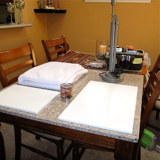
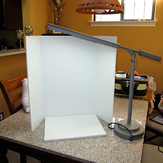
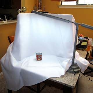
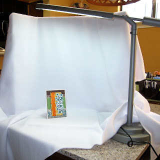
1. There is no need to invest in an expensive light box. The pictures above show my set-up, which consists of a tri-fold presentation board (the kind used for Science Fair projects), an Ott Light, 2 yards of white fleece fabric, and a can of condensed milk...hahaha! I bet that last item got your attention ;D I arrange the fabric over the tri-fold presentation board and then set up my Ott Light to cast light down over the draped fabric. My can of condensed milk is just the right size to prop my card against and does not obstruct my shot in any way. I purchased all of these items, except for the milk, from my local Hobby Lobby for just a few dollars. The whole set-up takes only a few minutes to assemble and even less time to take down.
2. Before I shoot any pictues, I make a few adjustment to my camera. First, I turn off the flash. Using the flash seems to create glare and hotspots in my photos, which in turn drown out details on my card. Me no likey this :(
3. Speaking of details...I want to capture all of them, so I switch my camera to the Macro setting. This allows me to get in really close and not waste any of the hard work spent crafting my little art piece.
4. After I have adjusted my settings and set-up my make shift light box, I manually set the White Balance by going to the White Balance setting on my camera, selecting "custom", aiming my camera at my little staging area so that only the white fleece fabric fills my lens and (on my camera) clicking the DISP button. This step may vary, but will probably be similar for many point and shoot cameras. Once I do that, I am ready to get this show on the road!
5. I get in really close for photos and take LOTS of pictures. Since I am going to the extra effort, I may as well make it worth my while. There is no bigger let down than setting all this up, taking one shot, and then finding out that it is blurry because my hand quivered a bit at the last second. UGH!
6. Once I have my pics and have loaded them on the computer, I do a little editing and select only the best ones, weeding out the ones that just aren't quite there. After I have the creme de la creme of photos sorted out from the...ummm...not so creme photos, I do a bit of editing in my photo editor. I crop out a lot of the background, brighten my white levels, and adjust the sharpness.
Compared to propping the card on the dining room table and just letting the camera do it's thing, there is an amazing difference! I figure, if I am going to take the time and creative energy to build a card for someone special, then I may as well attempt to present my work in the best possible light (pun intended) to the rest of the world. My pics may not be on the caliber of a professional photog, in fact, I can guarantee they're not, but with the use of a few tools and camera adjustments I can easily take a picture from gray and dull to vibrant and bright. Me likey that ;D
cheryl, i can't tell and maybe missed it if you said so or not, but is the ott light holding the folding section up or is that just how it looks... i have been trying to figure out how to best photograph my dolls that stand up, so i really appreciated this tutorial! thanks!
ReplyDeleteCheryl, thanks a million for re-posting your info on your light box. It's a really cool way to set one up. Love your cards and the beautiful colors you use on them. Can't wait to see what you do next! Thanks again, Geri
ReplyDeletep.s.....especially love the can of condensed milk for propping card up. :o)
ReplyDeleteI LOVE seeing how others take their photos. I thought about constructing a very crude light box at one time, but it never came to be. I like your technique a lot! It's like a big, open light box, no? Well, I think I even have a can of condensed milk in the pantry....LOL!
ReplyDeleteThanks, Cheryl! Great tutorial!
Great tutorial!!! Thank you SO MUCH for sharing!!!
ReplyDeleteHugs!!
:) Irina
Thanks for your great tips on photographing cards Cheryl. Makes my brown pizza box backdrop look really shabby!
ReplyDeleteFantastic tutorial Cheryl....I could just kiss you!!!!!!!!
ReplyDeleteIt is so annoying when you spend so much time making a beautiful card and you just can't get the picture to look as great as it is in real life. I'm ready to try your suggestions but do have a few questions for you. Is that a true Ott light that you have or something similar. I went on line and can't find it. Do you have the model number? Is it a 13 watt bulb or higher that you use with that light? Do you cast light only on the material behind the card or over the card also. How many inches from the top of your card is the light bulb? I think my biggest issue when taking pictures is getting my white balance right. I already do the no flash and macro setting.
Thanks again for sharing your knowledge of picture taking. Your cards look fantastic. You definitely know what you are doing. kjtbq@sbcglobal.net